Designing a Captivating Visual Experience
Not to be confused with a hometown hero, a homepage hero is a large banner that is displayed at the top of a website above the fold. It can be a picture, graphic, carousel, call-to-action (CTA), or something else. It’s the first element that visitors see before they hit “scroll.” It should grab web visitors’ attention and convey everything people need to know about your brand. Now that I’ve convinced you how important a hero image is, how do you design a good one? I’m glad you asked! As a Charlotte web design company, we have a ton of experience with this.
Hit ‘Em with a High-Quality Image
Perhaps it goes without saying but I’m saying it anyway – a homepage hero image requires, well, a nice image. That means something high-quality, not too grainy, and not too compressed. One of our favorite websites for this is Unsplash, which provides free high-resolution images without copyright protection.
You don’t have to use a photo though. You could use a graphic instead, for which we recommend Canva. It makes graphic design a breeze with its numerous customizable templates. Use it for hero images and social media posts too. Even though I’ve called it a hero “image,” your hero image may not be an image at all! It could be a video. Pexels offers free videos and you can customize the size before downloading one.
As always, be judicious about the image/graphic/video you’re using. You want to make sure it fits in with your brand identity. In addition to web design, we’re also a Charlotte internet marketing company so we can give you some advice if you need it.
Enhancing Your Terrific Text for Improved Conversions
It’s one thing to feature an image on your website in the hero section and another to generate new leads and conversions with a text overlay, which can be very effective. When you’re using text make sure to keep it short, use readable fonts, remember your target audience, and use a CTA or lead generation form to capture your web visitors. If you don’t know how to do those things, as an N.C. web designer, don’t worry, we’ve got you.
Make it Fit
I know I mentioned earlier you don’t want an image to be too compressed. What you’re looking for is a sweet spot – you want the image to be optimized, which means the photo loads quickly. Images should be less than 1MB and if yours is larger, you can make it smaller without losing image quality by using an image compression tool such as TinyPNG. It will reduce the size of your WebP, PNG, or JPEG file with smart lossy compression.
Size matters with the hero image because again, it’s large, attention-grabbing. That means it should be at least 1,200 pixels and have an aspect ratio of 16:9. A banner hero image should be 1600 x 500 pixels and for larger screens you can push to 1,800 pixels.
What follows are two examples for our work as a Charlotte web designer.
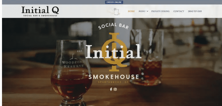
For the social bar and smokehouse Initial Q, we created a video that displays images of food, drinks, and the interior.

It works because the images are high-quality, the company logo is front and center, and we’re hopefully whetting your appetite by displaying the food and drink options.
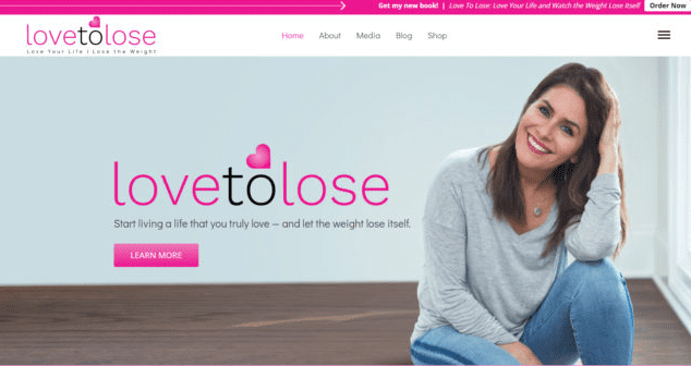
For our client Camille Martin, RD, we designed this:

It works because she tells you what she does and the CTA button is prominent, bright, and contrasts with the background colors.
Have we inspired you to use a homepage hero image? We hope so. As a Charlotte web design company, we create these all the time. Get in touch with us via email or call (704) 336-9113.


